Nancy Thebaut • Skidmore College
Recommended citation: Nancy Thebaut, “Zones, Stripes, and Strata: The Banded Grounds of Early Medieval Paintings,” Different Visions: New Perspectives on Medieval Art 9 (2023). https://doi.org/10.61302/PTAF6811.
An elaborately framed rectangular field of blue and turquoise stripes fills folio 126v in the late tenth-century Gospels of St Andrew of Cologne (Fig. 1).[1] Non-figurative and devoid of any text, the painting acts as the interior cover, or frontispiece, to the Gospel of Luke. Varying in width and opacity, roughly five blocks of color traverse the framed field: seafoam green striations frame the top and bottom, and two thicker swaths of blue surround a smaller field of light blue at the image’s center. Thin stripes of similar shades punctuate the wider bands of color, blurring the boundaries between one section of the image and the next. Each band bears the trace of the artist’s hand, which swept the brush across the folio with varying amounts of pressure and pigment.
Although the painting is well known to medieval art historians—it is the cover-image of Herbert Kessler’s introductory volume, Seeing Medieval Art—its meaning remains somewhat enigmatic. Scholars have, to date, primarily focused their readings of this painting on the visual effects and purpose of its multicolor stripes. Kessler writes that “the painting served as an aide in transcendental contemplation,” and that “the thin washes of celestial colors elevate the animal flesh itself.”[2] More recently, Vincent Debiais has proposed that the painting is a “window opening to the horizon, to the gathering of heaven and earth.”[3] Others, still, are skeptical about whether the image is in fact complete: perhaps the scribe never added text atop these horizontal lines, as we see on other folios in the manuscript. The page is most often considered on its own or in relation to other figure-less images made in the early Middle Ages, but rarely in relation to the many other striped Ottonian manuscript paintings, whether abstract, figural, or even diagrammatic, in which stripes are visually prominent.
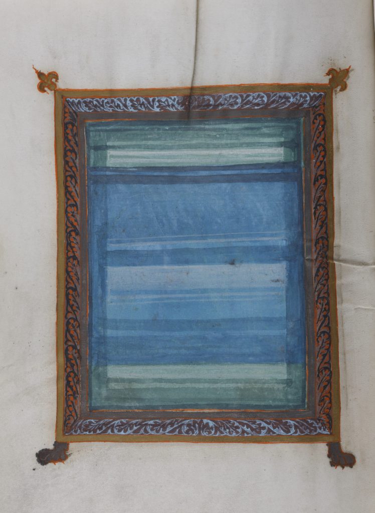
Fig. 1. Gospels of St Andrew of Cologne (Darmstadt, Hessisches Landesmuseum Inv. Nr. KG 54:213a, b), f. 126v, Cologne, late 10th c. (photo courtesy of Hessisches Landesmuseum Darmstadt).
This essay takes as its point of departure the St Andrew of Cologne colorfield painting in order to query the visual vocabulary of stripes in manuscript illuminations of this period. Stripes proliferate in multiple kinds of paintings made in tenth and eleventh century Europe, especially in those areas ruled by the Ottonian and subsequent Salian Empires. We see evidence of artists exploring what stripes can do in and for their images at important manuscript production centers across Germany, Northern France, Switzerland, and present-day Luxembourg. Although previous art historians have remarked upon the sudden “stratification of space” in art made in this period and regions, there has yet to be a study of the ways that stripes function across multiple kinds of images.[4] Indeed, three types of striped images are typical of this period of manuscript painting: non-figural (like the St Andrew of Cologne painting), narrative, and cartographic. A comparative inquiry is key, I argue, in order to understand how medieval artists explored the semiotic potential of the seemingly simple stripe and made it an important tool for structuring space, specifying place, and suggesting depth.
Indeed, the formal vocabulary of the St Andrew painting is hardly idiosyncratic: stripes fill the pages of several medieval codices and appear in a variety of contexts. They frequently constitute the grounds upon which biblical narratives are depicted, such as in the image of Christ’s Ascension on folio 12 recto of an early eleventh-century sacramentary made at the monastery of St Michael in Fulda, Germany (Fig. 2).[5] With arms raised and his back turned, Christ traverses the green, white, pink, and blue banded ground to reach God the Father, whose hand extends from the painting’s upper frame. These horizontal, variously colored stripes punctuate the narrative image, dividing it into several strata.
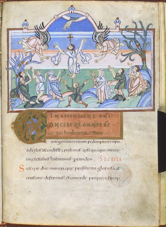
Fig. 2. Lucca Biblioteca Statale di Lucca MS 1275, f. 12r, Fulda, early 11th c. (photo courtesy of Biblioteca Statale di Lucca).
Filling the lower half of the image is a green field, which surrounds the apostles, Mary, undulating hills, a tree trunk, and—perhaps most notably—Christ’s feet. Immediately above is a swath of light pink, which is framed by a thin stripe of white and light orange. Figural images in this middle zone of the painting include Christ’s lower torso, the hands of two angels, and a few of the trees’ branches. A field of varying bands of blue fills the remainder of the upper section of the miniature, and these blue bands surround—and serve to unite—the angels’ bodies, Christ’s face, a small processional cross, and the Hand of God.
The relationship between the stripes and figures in the Fulda Ascension painting might at first seem haphazard: the angels, for instance, traverse multiple bands of color, and their wings even extend beyond and under the frame. But at other moments, it appears much more deliberate: the horizontal bar of the cross almost perfectly aligns with the upper edge of the lowest stripe of blue, and Christ’s upturned face is figured immediately above the band of orangish pink. In other words, the artist has plainly made a series of choices to align particular colors with places, people, and even body parts.
Widely reproduced and disseminated throughout the Ottonian empire, the fifth-century commentary on Cicero’s Dream of Scipio by the Latin allegorist and grammarian Macrobius (d. 430) frequently includes at least two diagrams that consist of a series of horizontal stripes within a circle.[6] The stripes, of which there are often five or seven in total, are sometimes painted, and each denotes a different climate zone of the earth. On folio 18 recto of an early eleventh-century illuminated copy of Macrobius’ text made in northern France, five colorful bands traverse a circle that is surrounded by a series of letters (Fig. 3).[7]
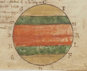
Fig. 3. Paris BnF Lat. 6371, f. 18r, n. France, 11th c. (photo courtesy of Bibliothèque nationale de France).
In Macrobius’ design, each color denotes one of the earth’s climate zones: the wide swath of orange at center represents the equatorial region, and the yellow fields on the upper and lower parts of the circle represent frigid zones, or the North and South Poles. It is only the darker green stripes that denote areas with a climate that is, according to Macrobius, suitable for human life.[8] Within this seemingly simple diagram, the relationship between color, stripe and place is codified. Color even acquires iconographic meaning: orange represents an area that is unbearably hot, yellow suggests cold, and the green signifies habitable and arable land.
Stripes are the seeming subject of the St Andrew painting, the ground for narrative action in the Fulda Ascension, and iconographically encoded in zonal maps, but a comparative study of these images will further reveal that the meanings and functions of stripes in Ottonian illuminations were multivalent and not limited to a single kind of image. Following an overview of the ways that art historians have studied the abstract and ornamental grounds of manuscript paintings, the essay turns to Ottonian Macrobian maps. Within these widely reproduced diagrams of the climate zones, stripe and place become inextricably linked. The logic of Macrobian maps, I suggest, likely informed the making and reception of stripe-filled narrative images, wherein color can at once suggest geography and (in)accessibility, visual and physical. I then turn to a set of contemporary narrative images that demonstrate with particular clarity how artists understood stripes to differentiate place, like on the Macrobian maps, but also suggest depth. The narrative of Christ’s Ascension provided artists with an opportunity to consider how stripes could suggest the traversal of space and (in)visibility of Christ to various parties. Focusing on two images of Christ’s Ascension made ca. 1000 at two important Ottonian scriptoria, Fulda and Reichenau, I show that stripes served as a powerful artistic means to demarcate different strata of sanctity between Earth and heaven, suggest that there are zones of varying visibility within the image, and even create the illusion of depth. In so doing, this article aims to offer an account of the multiple meanings and functions of striped grounds of Ottonian manuscript illuminations. Finally, a careful reconsideration of the striped grounds of these images invites a broader re-evaluation of the meaning and pictorial effects of the so-called ‘background’ in early medieval narrative images.
Laying the Groundwork: Stripes, Bands, and Blocks
Attention to the grounds of medieval manuscript illuminations has thus far focused primarily on questions of pattern, ornament, and abstraction. Jean-Claude Bonne’s research on ornament has been crucial to the development of a vocabulary for medievalists to talk about abstraction and pattern, as has work by Victor Elbern on aniconism in medieval art.[9] Recent collaborative efforts have also significantly shaped the state of knowledge on abstraction in the Middle Ages, including Elina Gertsman’s 2021 edited volume, Abstraction in Medieval Art: Beyond the Ornament, the 2019 colloquium, publication, and exhibition Make it New: Conversations avec l’art médiéval at the Bibliothèque nationale de France spearheaded by Charlotte Denoël, and the international project, “Abstraction before the Age of Abstract Art,” co-organized by Vincent Debiais and Gertsman.[10]
Debiais has also focused extensively on color in early medieval manuscripts, especially monochrome paintings. In a 2021 article, “Color as Subject,” he studies the color-filled grounds of early medieval paintings as well as fields of color that are figureless. He considers how a single color can “act as an image of sacredness,” or “a figure presenting a theological reality in the interplay of contrasts and complementarities between colors,” and be as a powerful means of distinguishing between the earthly and the divine.[11] Moreover, color is rhetorically charged: it can “create semantic links among visual elements and at different scales.”[12] One of the most significant contributions is the importance to which he assigns color in medieval paintings writ large: “it is what makes possible the image’s implementation and what reveals it, surrounds it, and gives it a particular semantic depth.”[13]
In the context of Ottonian and Salian manuscript illuminations, specifically, several scholars have considered the relationship between medieval patterned paintings and the materials to which they may allude, especially precious stones and textiles. Anna Bücheler, for instance, has studied the so-called carpet pages and ornamental backgrounds in Ottonian manuscripts in relation to a variety of precious cloths, including Byzantine silks.[14] These “carpet” or “curtain” pages are often devoid of text and figural images, and they appear prior to the start of one of the gospel texts. A few of these supposedly textile-emulating folios are composed entirely of stripes. For instance, folio 59 recto in an eleventh-century evangeliary made in Echternach is covered in crimson paint and sixteen horizontal stripes that are painted in a slightly darker shade of the same color (Fig. 4).[15]
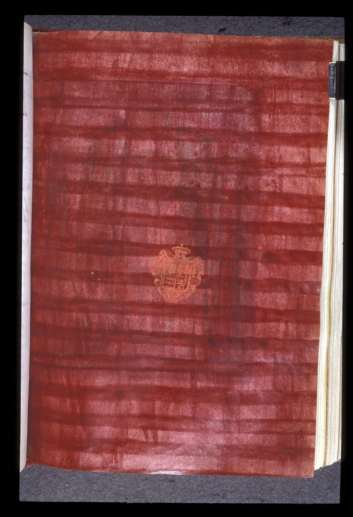
Fig. 4. London, BL MS Egerton 608, f. 59r, Echternach, 2nd or 3rd quarter of 11th c. (photo by permission of the British Library).
A close examination of the relationship between stripes and space in medieval paintings was penned by Miriam Schild Bunim in Space in Medieval Painting and the Forerunners of Perspective (1940). A student of Meyer Schapiro, Bunim traces the longue durée history of the depiction of space in medieval art and notes the establishment of a “stratified space,” or a space of increasingly solidified bands that create a “vertical surface” in Carolingian art and that persists in the tenth and eleventh-century paintings in the schools of Reichenau, Echternach, and Trier.[16]
Although much of the research on grounds and abstraction has focused on art of the early Middle Ages, there are a few important exceptions to this trend. Bernd Rau’s 1975 dissertation, Die ornamentalen Hintergründe focuses primarily on French Gothic book illuminations, and Xénia Muratova’s 2007 article explores the thirteenth-century “fonds,” or grounds, of manuscript paintings.[17] In a similar vein, Aden Kumler demonstrates in a 2021 essay that a framed, figure-less miniature in a fifteenth-century illuminated copy of Guillaume de Deguileville’s Pèlerinage de l’âme that the illuminator was representing a precise passage from this text in his abstract, pattern-filled painting.[18] Amy Knight Powell and Stefan Trinks have also been part of an important (and recent) conversation on late gothic abstractions.[19] And on late medieval stripes more broadly, Michel Pastoureau has studied their meaning and recurrence on clothing, coats of arms, and other markers of individual and group identity.[20] In the majority of his case studies, stripes are strongly associated with the devil.
Although Pastoureau’s project does not focus on those stripes that act as the grounds for narrative images, his inclination, like that of Kumler, to uncover a possibly fixed meaning or even an iconography of stripes is not far afield from the aims of this essay, as will be made clear in the following sections. These images reveal, quite plainly, how artist(s) were thinking about the banded grounds of figural representations not as a textile-emulating background, but first and foremost as a means to differentiate space, identify a specific place, suggest depth, and even denote various strata of sanctity and so make distinctions between more or less sacred parts of the image.
Stripe as Place
The relationship between stripes of color and place is perhaps most obviously codified on contemporary zonal or hemispheric maps that depict the earth’s northern and southern hemispheres divided into climatic zones. These maps are also known as Macrobian maps, as they frequently accompany the early fifth-century commentary by Macrobius Ambrosius Theodosius of Cicero’s Dream of Scipio (Somnium Scipionis), the final section of his De republica (54-51 BCE). The subject of the text is the cosmic dream of Scipio, a future consul and Roman military tribune. A widely copied and circulated text throughout the Middle Ages, Macrobius’ neoplatonic commentary was a touchstone for medieval understandings of allegory, exegesis, and dreams. The intellectual impact of its text was far-reaching, and several manuscripts made before 1100 depict zonal maps alongside the commentary text, as Alfred Hiatt has shown.[21] In his article on early Macrobian maps, he notes that the dissemination of Macrobius’ commentary spread throughout Germany in the tenth and eleventh centuries, especially, and most copies contain a zonal map, unlike in many earlier versions.
But the images that often accompany the text are primarily noted by map historians and less frequently put in dialogue with other (non-cartographic) images in medieval art history, with the exception of the recent and important work by Megan McNamee.[22] Among those images that are often found within manuscripts of Macrobius’ Commentary are four diagrams, each of which Macrobius tells the reader how to create: (1) Earth and planetary spheres within the zodiac; (2) rainfall on Earth; (3) a zonal map in which Earth is divided into cold, hot, and temperate zones; (4) a zonal map that suggests the relationships between climate zones in heaven and those on Earth.[23] It is the final two maps in this list that will be of particular interest in this essay.
In book two, chapter five, Macrobius writes about the various zones of the earth, which he calls “cingulae,” or belts, and distinguishes between those that are inhabitable and those that are not:
You [Scipio] can also make out certain belts [cingulae], so to speak, which encircle the earth; you observe that the two which are farthest apart and lie under the poles of the heavens are stiff with cold, whereas the belt in the middle, the greatest one, is scorched with the heat of the sun. The two remaining belts are habitable: one, the southern, is inhabited by men who plant their feet in the opposite direction to yours and have nothing to do with your people; the other, the northern, is inhabited by you Romans.[24]
He continues his description of the five belts that “girdle the earth” and “hold the sky” in greater detail only a few lines later, writing that two small “belts” encircle the earth’s northern and southern extremities, which are “frozen with perpetual cold.”[25] No one can live in these areas or in the central and largest “belt,” which is “scorched by an incessant blast of heat.” It is the areas between these inhabitable zones that have a more temperate climate and “in these alone has nature permitted the human race to exist.”[26]
To make the location of the belts or cingulae of the earth even plainer, Macrobius then explains how to create a diagram of precisely what he is describing:
Let us draw a circle to represent the earth with the letters ABCD inscribed. On either side of A inscribe the letters N and L; beside B inscribe M and K; beside C, G and I; and beside D, E, and F. Draw straight lines connecting the letters just mentioned, that is, from G to I, from M to N, from K to L, and from E to F. The two spaces at the extremities, one extending from C to the line GI and the other from D to the line EF are to represent the regions perpetually stiff with cold, the upper one being the northern and the lower the southern extremity. The middle belt from N to L is to be the torrid zone. As a result, the belt from I to N is tempered by the heat beneath and the cold above it, and the zone from L to F is tempered by the heat above and the cold beneath it. The lines drawn for our diagram must not be thought of as straight lines, for they are the circles mentioned earlier, the arctic and Antarctic circles and the two tropics.[27]
The artist of such a diagram on folio 17 recto in a late tenth-century manuscript made in northern Italy followed Macrobius’ orders precisely, creating a letter-studded circle divided into five zones (Fig. 5).
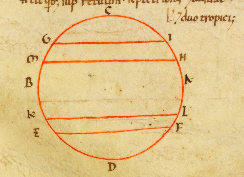
Fig. 5. Bamberg Staatsbibliothek Msc. Class. 38, f. 17r, n. Italy, late 10th c. (photo courtesy of Staatsbibliothek Bamberg).
With the aid of a compass, the artist drew a circle and neatly divided it into five zones to represent the five climate zones of the earth. The letters A through N surround the circle and correspond precisely to those places where Macrobius advised his reader to place them. Other artists elaborated on Macrobius’ zonal map, however, adding other features that he does not mention in his ekphrastic text. One artist, for instance, went one step further and added labels that identify each of the five climate zones (Fig. 6).
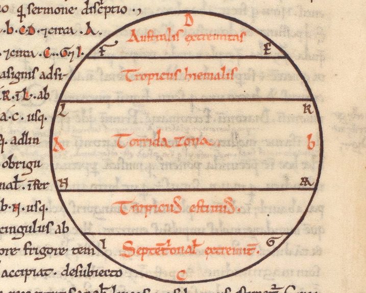
Fig. 6. London BL MS Cotton Faustina C I, f. 85v, Welsh, 11th c. (photo by permission of the British Library).
In a south German manuscript made ca. 1000, the artist uses a deep shade of a greyish blue to suggest bodies of water, including the plainly labeled “oceanus” at the circle’s center and various seas (“mare Caspium,” for instance) (Fig. 7).
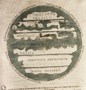
Fig. 7. Oxford Bodleian Library D’Orville 77, f. 100r, s. German, ca. 1000 (photo courtesy of Bodleian Library).
Perhaps most striking, however, is the artist’s decision to introduce a series of irregular lines to Macrobius’ otherwise straight-edged diagram. Although each zone is still delineated by a straight, horizontal band, the artist(s) have drawn a series of curving lines to create abstract shapes that suggest their desire to make the map recall the undulating and irregular contours of land on Earth. They at once wed the precision of Macrobius’ zonal map with a visual evocation of the irregularity of shorelines. As fantastical as these forms are, they gesture toward a kind of naturalism, or a desire to depict Earth in a way that is not entirely reductive or visually schematic.
In several surviving pre-1100 maps, horizontal bands of color are the foremost means of distinguishing between the earth’s climate zones. One such multi-colored map with which this article began appears on folio 18r in an early eleventh-century manuscript likely made in Champagne (Fig. 3). Here, the letters suggest the possibility of six distinct stripes, but there are only five colors, opaque to various degrees, that fill the circle. The central stripe—representing the hot equatorial zone—is the widest, and each adjacent stripe is a different color, making plain the visual and spatial difference in this otherwise simple diagram. The repeating colors and their placement recall the placement of colors in the painting in the Gospels of St Andrew of Cologne, a comparison to which we will later return.
Color is frequently a primary means of distinguishing between various zones in yet another diagram that Macrobius describes and explains how to create in his Commentary. In chapter seven of book two, he writes about the relationship between the sky’s zones and those of Earth and then offers drawing instructions for those who wish to create a second zonal map:
The physical nature of the sky is responsible for the differences between the temperate and extremely warm and cold zones upon earth: the same sort of heat or cold that grips any sector of the upper air at any time is conducted to that portion of the earth which lies directly below. Since the diverse regions of the sky with their definite demarcations have been referred to as zones, we must assume the same zones here on earth, just as the image of a large object in a small mirror reproduces its exact features and lineaments on a reduced scale in their correct proportions (my emphasis)…With this diagram you will have no difficulty in seeing that each zone on the earth gets a climate that is temperate or extreme from the portion of the sky directly above it.[28]
In the same Macrobian manuscript with which we began this section, we see that the (likely same) artist has taken a similarly conservative approach to this second zonal map (Fig. 8).
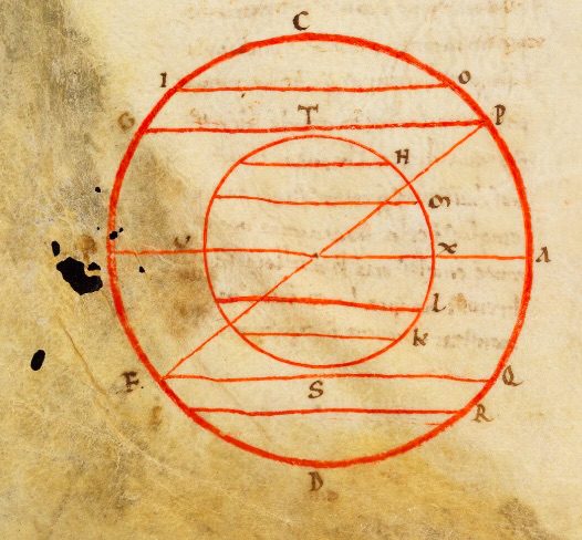
Fig. 8. Bamberg Staatsbibliothek Msc. Class. 38, f. 18v, n. Italian, late 10th c. (photo courtesy of Staatsbibliothek Bamberg).
Here, we see two spheres, the smaller of which represents the earth, and a diagonal line that cuts across the two circles and represents the zodiac line. The Bamberg diagram makes plain that the earth and its zones are essentially a smaller image of its larger celestial counterpart. The addition of color in a zonal diagram in a tenth- or eleventh-century manuscript of Macrobius’ Commentary made in Fleury helps underscore the differences in climate zones on Earth, specifically (Fig. 9).
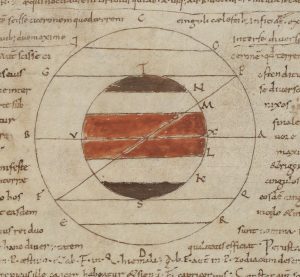
Fig. 9. Paris BnF MS Lat. 8663, f. 38v. Fleury, 10th-11th c. (photo courtesy of Bibliothèque nationale de France).
A brownish hue fills the very upper and lower zones of Earth’s sphere, and two bands of red fill the central portion of the circle. These diagrams and the accompanying text that the artist used in their making underscore the fundamental visual relationship between the banded zones of heaven and Earth: one is a mirror image of the other, albeit on a “reduced scale in…correct proportions.” And it is the addition of paint, at least in the case of Paris BnF MS Lat. 8663 (Fig. 9), that signals those zones on Earth.[29]
We can learn much about the signifying power of color and lines, specifically, in studying Macrobius’ text, his directions to draw zonal maps, and the resulting images made by early medieval artists. Specifically, bands of color play a crucial role in distinguishing one geographic space and its climate from another. Straight and horizontal lines also demarcate a change in place, which can correspond with a change in geography, climate, and physical access. As Macrobius writes, some of the zones are simply uninhabitable and therefore out of reach for humans. Moreover, a straight line does not correspond to a straight line in reality: “The lines drawn for our diagram must not be thought of as straight lines, for they are the circles mentioned earlier, the arctic and Antarctic circles and the two tropics.”[30] Finally, Macrobius’ text and diagrams teach us much about medieval understandings of the relationship between Earth and heaven: they are, at least in formal terms, mirror images of one another. The bands that demarcate various zones in heaven correspond precisely to those on Earth, as the second zonal map makes clear.
As Hiatt and others who have studied the dissemination of Macrobius’ Commentary have demonstrated, Macrobian maps were widely produced and circulated in Ottonian manuscripts, suggesting that many medieval artists created, saw, and understood the iconography of stripes in Macrobius’ zonal diagrams. Their frequently color-filled bands suggest distinct zones of a space, a scaled relationship to the heavens, and denote zones of physical and visual accessibility. Moreover, their accompanying text makes plain how we should interpret the simplest of forms, including the straight line. Text and image in the Commentary on the Dream of Scipio offer powerful interpretive tools to those studying early medieval narrative paintings with striped grounds. For indeed, early medieval artists seemingly use the same visual logic of stripes but to slightly different ends, as we will continue to explore: the banded grounds of these narratives, often biblical images, are a fundamental means of not only structuring biblical narrative but also suggesting depth and various zones of visibility and sanctity. In attending to the logic of stripes in Macrobian maps, we can more effectively understand those banded grounds that Christ traverses in early medieval paintings of the Ascension, for instance, to which we will now turn.
Color Bands and Depth: Ascending Upwards and Backwards
Medieval images of the Ascension offer an excellent case study for understanding the ways that medieval artists harnessed the signifying potential of horizontal stripes of various colors in narrative paintings. In the painting made in Fulda with which this article began, the various bands of color—from green below to blue above—and their strong association with various figures and even body parts suggest that these bands do not simply divide the image into three primary parts (Fig. 2). They mark Christ’s transition from one realm to the next, but they also strongly distinguish between his body parts, namely his feet, torso/buttocks, and face, each of which is surrounded by a different color.[31]
The visual distinction between Christ’s body parts is also central to yet another, roughly contemporary iconography of Christ’s Ascension that appeared ca. 1000 in Insular manuscript illuminations and quickly spread thereafter to continental Europe. Coined the “disappearing Christ” in an oft-cited article by Meyer Schapiro, this iconography can be characterized by the artist’s refusal to figure the upper parts of Christ’s body during his ascent; it is as though Christ has partly exited the image field.[32] The first known appearance of this iconography is in the Missal of Robert of Jumièges, which was made in Canterbury in the early eleventh century (Fig. 10).
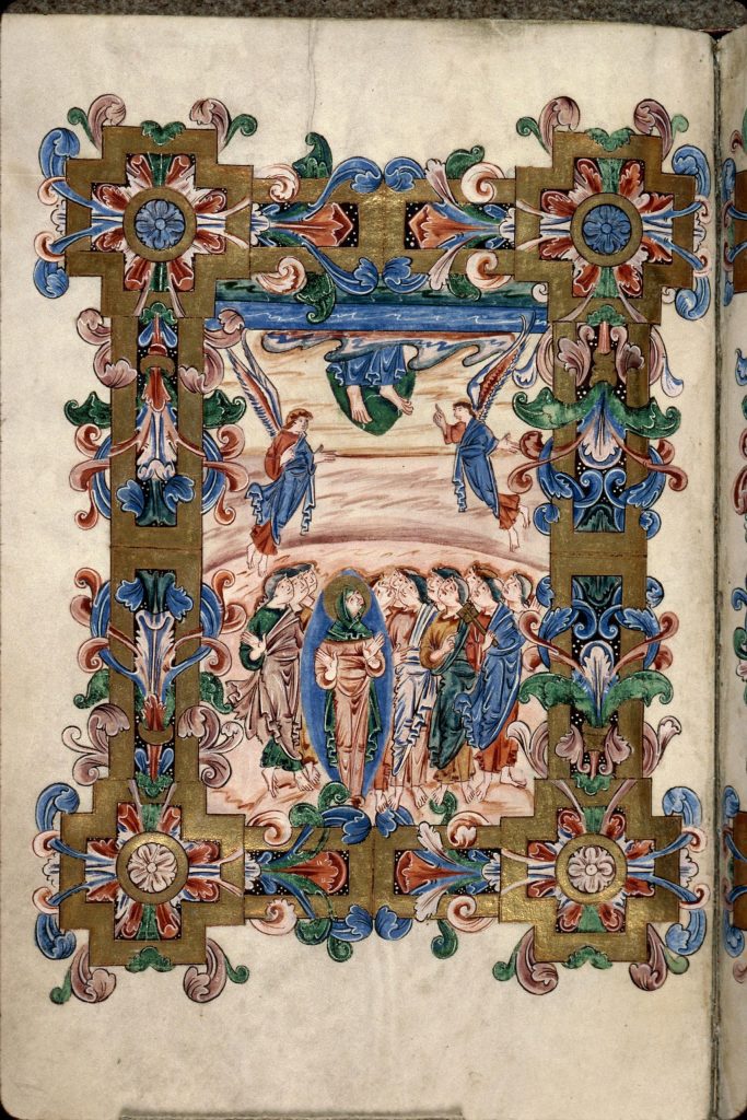
Fig. 10. Rouen Bibliothèque municipale MS Y.6, f. 81v, Canterbury, early 11th c. (photo courtesy of Bibliothèque municipale de Rouen).
Here, the Virgin Mary and apostles gather below Christ’s dangling feet, flanked by two angels, one of whom gestures towards his feet. Mary looks up and has an ostensibly unimpeded view of her son’s feet as he exits the image, which is bordered by an elaborate, foliate frame.
In his article on this iconography, Meyer Schapiro argued that this new way of depicting the Ascension was the product of the creative medieval illuminator, who wanted—through “optical realism”—to show what the ascending Christ would have looked like to the Apostles below.[33] Robert Deshman later took issue with aspects of Schapiro’s argument and proposed an alternative reading of the new iconography. He begins by making the simple but important point that the iconography’s focus on the apostles’ visual experience at the Ascension was likely inspired, at least in part, by Luke’s account of the Ascension in Acts 1:9-10, wherein a cloud removed Christ “out of their [the apostles’] sight.”[34] In addition to identifying the ‘word illustration’ at play in the disappearing Christ, Deshman argues that the iconography emerged from longstanding exegetical traditions as well as tenth-century monastic reform, in which “a new emphasis on spiritual contemplation…called into question this inherited tradition of depicting the heavenly deity.”[35] For Deshman, the image of the disappearing Christ underscores the limits of corporeal vision and also suggests that Christ’s image must be removed from view in order for the viewer (or apostles) to spiritually see him.
Both Deshman and Schapiro’s accounts rely on a longstanding exegetical tradition of Christ’s body parts.[36] In the case of the disappearing Christ, his feet are visible and his head is obscured (or simply not depicted). This is surely not incidental, as Christ’s feet were widely understood to represent his humanity and incarnation, whereas his head symbolized his divinity.[37] Gregory the Great writes in his commentary on Luke 7:38, in which Mary Magdalene anoints Christ’s feet, that “we can also understand by his feet the mystery of the Incarnation…We can appropriately take his head to represent his divinity.” Bede, in turn, argues that Christ’s head can be understood as the head of the Church, and his feet its members.[38] This ecclesiological interpretation was likely influenced by Augustine, who believed that the Ascension was not yet fully completed: Christ’s head is in heaven, but his body—understood to be the Church—remains on Earth.[39] Deshman also points to the importance of Augustine’s understanding of the Ascension on the invention of the disappearing Christ iconography: Christ’s body must be removed from view for the apostles to truly see Christ for the God that he is.[40] Deshman’s argument hinges on these exegetical accounts in order to work: in the case of the disappearing Christ, the feet representing his humanity can be pictorially represented, but the divine head defies the bounds of the image.
Since Deshman’s proposed revisions to Schapiro’s argument, the “disappearing Christ” iconography has continued to attract considerable (art) historical work.[41] In fact, it has garnered so much attention that other iconographies of the Ascension during this period, including the Fulda image, have often been thought of as acting in opposing terms: in other words, Christ is herein plainly visible; the artist has not chosen to obscure the upper parts of his body. But I would propose that the artist of the Fulda Sacramentary Ascension, who likely saw other contemporary renditions of this narrative moment, also suggests—but through very different formal means—that Christ’s body is, at least in part, visually inaccessible to the apostles below (Fig. 2).
The green band that fills the lower third of the framed miniature in the Fulda Ascension demarcates the space of the apostle and, most importantly, Christ’s feet. It is as though this part of the image presents the formal components typical of “disappearing Christ” iconography. But rather than not depict Christ’s torso and face, as artists of the disappearing Christ were wont to do, the Fulda painter uses a different formal means—namely bands of color—to suggest that only Christ’s feet can be seen by the apostles at this particular moment. Specifically, it is through the careful articulation and disposition of the striated ground that the artist suggests that while we, the viewer, can see Christ from head to toe, the apostles cannot. As noted in the introduction to this essay, the lower contours of Christ’s face neatly coincide with the lower edge of the blue stripe that surrounds his head and hands. Through this marked change in color, from orangish pink to blue, the painter suggests that Christ’s divine face exists in a realm that is distinct from those below and is visually inaccessible to those apostles who see his feet, those parts associated with this humanity. But while contemporary images of the “disappearing Christ” can help us understand the ways that artists like the Fulda painter suggest the invisibility of Christ’s upper body to the apostles below, how might we understand the decision to depict Christ seemingly turned away from the viewer, thus revealing his back, as he ascends?
The use of color bands in a roughly contemporary painting of the Ascension made in Reichenau reveals how this and likely other Ottonian artists understood the semiotic potential of colorfields in their paintings. On folio 131v in the Pericopes of Henry II, which was made ca. 1007-1012, the Ascension of Christ is depicted atop a field of pink, purple, and green (Fig. 11).[42]
Fig. 11. Munich Bayerische Staatsbibliothek MS Clm 4452, f. 131v, Reichenau, ca. 1007-1012 (photo courtesy of Bayerische Staatsbibliothek, Munich).
The purple stripe—which is actually more of a block—fills most of the image’s ground. Christ’s feet are figured atop an orange, cloud-like field, and his arms are outstretched and aligned with the top edge of the purple field. Christ’s entire face and upper body is figured atop the pink stripe. Two angels flank Christ; although their upper bodies appear amidst the pink band, their lower bodies are ostensibly obscured by the purple ground. They each raise one hand and extend the other below and within the purple field.
The angels’ bodies—particularly the obfuscation of their lower half—suggest, quite remarkably, a sense of depth and invite us to reconsider the relationship between the bands of color. The pink band does not just exist above the purple field, but also behind it. Christ’s ascension is not unidirectional, then: he ascends upward but also behind this purple block, which exists not only below, but in front of the pink field. In other words, we can no longer understand the painted stripes to act as an entirely flat plane; rather, some are further recessed than others.
Although the Reichenau Ascension painting has not been the subject of significant art historical scrutiny, the relationship between monochromes and depth has been the subject of recent scholarship on medieval abstraction. Vincent Debiais has noted in the context of a gospel book made ca. 1030 in Cologne that the large, gold ground that fills the space behind the evangelist Matthew suggests depth, thus challenging the “obvious flatness” of medieval images (Fig. 12).[43]
Fig. 12. New York J.P Morgan Library and Museum MS M.651, f. 8v, Cologne, ca. 1030 (photo courtesy of J.P Morgan Library and Museum).
He encourages scholars to read monochromes in the Cologne Gospel Book as “successions of plans, as photographs or theatre stages…a visual device participating in the composition of the whole image.”[44] The Reichenau Ascension painting further supports Debiais’ claim, and perhaps in even stronger ways than the Cologne miniature: by not depicting the lower half of the angels’ bodies, their artists reveal that there is a recession in space as one moves up the page. Purple does not only exist below pink, then; it is also in front of it. In other words, Christ ascends both upwards and into the image’s highest and most recessed part.
This brings us back to the Fulda miniature, in which Christ’s back faces the viewer as he ascends to heaven (Fig. 2). Although the angels’ lower bodies do not plainly exist behind the central field of color, as they do in the Reichenau painting, I would suggest that Christ’s bodily disposition—namely that of a Rückenfigur, or dorsal figure—suggests, through yet another formal means, that he ascends not only upward, but into the depths of the image.[45] The green, pink, and blue fields constitute a perspectival system that allows for both upward and inward movement. Moreover, other parts of the painting suggest a sense of depth that might initially escape the viewer: the wings of the angels appear both in front of and behind the image’s architectural frame, which suggests the celestial city of Jerusalem. Like the angels in the Reichenau painting, they further underscore that the image is not unidirectional, as the upper parts of the painting are also those that are the most spatially recessed. The different-colored hills in the image’s foreground also lend a sense of depth to the lowest part of the image. Turning to other contemporary images, like the Ascension painting made in Reichenau, can help us understand how medieval artists understood color bands to operate more broadly: they underscore a vertical hierarchy as Christ moves from the earthly to celestial realms, but they can also suggest depth, with the green field in the foreground and the blue ground in the background. Within this recessed field, the hand of God acts as a quasi-vanishing point.
***
In the case of all three kinds of striped images I have shared in this essay, their privileged medieval viewers were familiar with these varied uses of stripes and understood their meaning and visual effects interchangeably. Specifically, the formal resonance between the color bands in narrative images of the life of Christ and those of Macrobian maps invited the viewer to associate individual color bands with place. Moreover, they suggest in both instances that some of these places—each demarcated by a horizontal band of color—are more accessible than others. In the case of zonal maps, certain zones are not fit for living because of extreme temperatures;[46] in the case of paintings of the Ascension, particular zones are not physically and thus visually accessible to the apostles. In other words, despite the obvious differences between Macrobian maps and the colorful ground that fill Ottonian paintings, there is an undeniably strong association between horizontal band, place, and accessibility across both kinds of images. Macrobian maps provide yet another kind of tool to both medieval viewer and art historian to understand how this seemingly ornamental background profoundly shapes the staging and meaning of a narrative image like Christ’s Ascension.
To return to the Darmstadt painting with which this paper started: the turquoise, dark blue, and pale blue bands that traverse the framed field in the Gospels of St Andrew of Cologne were undoubtedly created and understood in a visual culture in which colorful stripes carried numerous potential meanings. Although they do not collectively create a neatly labeled diagram, nor do they comprise the ground for a narrative image, we should understand their meaning in relation to these formal counterparts. Indeed, there are striking similarities between the Darmstadt painting and contemporary Macrobian maps.
Consider, for instance, the number of different colored zones, or cingulae, that accompany Macrobius’ text, as in the eleventh-century copy from northern France (Fig. 3). There are five primary bands of color in the zonal map, and colors repeat on the outer and inner most edges of the equatorial zone. This formal logic is repeated in the Darmstadt gospels painting; there are approximately five primary fields of color (although they are, admittedly, difficult to enumerate precisely!), varying from turquoise to light blue, and the turquoise stripes act as an outer frame to the upper and lower parts of the image, much like the light green in the Macrobian map.
Recall that in his analysis of the Darmstadt illumination, Debiais writes that it is a “window opening to the horizon, to the gathering of heaven and earth.” Indeed, Earth and heaven are evoked through this striped ground, but in an even more exacting way than Debiais recounts. To take his observation one step further: the stripes in the Darmstadt painting were in all likelihood shaped by and in turn participate in an iconography of stripes in Ottonian Europe in which stripes not only suggest space but can also tell us something about that space based on its color and relationship to other stripes, namely, its inhabitability, visual accessibility, and depth. When read alongside its striped counterparts, other readings of the Darmstadt painting become apparent: as the frontispiece to the Gospel of Luke, its multicolor stripes recall a schematic image of the world and so also the limits of what one can see and know. Moreover, a comparative study has made plain that the image is hardly flat, as it has often been described by scholars, but rather one that likely suggests the recession of space, with those highest stripes furthest from our reach.
All three types of paintings I have studied here – abstract, figural, and cartographic – suggest that there was a codified iconography of stripes that medieval artists variously used to not only create space but also make clear the hierarchy of this space. The stacking and repetition of stripes of various colors created an elaborate perspectival system that we understand best only when examining an array of different kinds of paintings in which they appear as well as those narrative images, especially, when artists were tasked with a representational challenge, such as Christ’s traversal of space and eventual disappearance to the apostles at the moment of the Ascension. The Fulda and Reichenau images are herein hardly flat, and their striped grounds are far from purely ornamental; to read them as such is to overlook a creative, albeit short-lived perspectival system that was profoundly shaped by medieval Christian theology, understandings of vision, and – perhaps most surprisingly – ideas about the climate.
References
| ↑1 | My sincere thanks to Rachel Dressler, Ben Tilghman, and the anonymous reviewers of Different Visions for their generous feedback on this essay. |
|---|---|
| ↑2 | Herbert Kessler, Seeing Medieval Art (2004). Kessler discusses the image on p. 173; see also plate 4. The cover of Kessler’s book is in fact a tightly cropped version of this painting. In its partial state, the rhetorical power of the image’s manipulation becomes clear: it closely resembles the work of a twentieth-century abstract expressionist. |
| ↑3 | Vincent Debiais, “Colour as Subject,” Abstraction in Medieval Art: Beyond the Ornament (ed. E. Gertsman, 2021), pp. 33-53, p. 46. https://doi.org/10.2307/j.ctv1g13jk5.5 |
| ↑4 | Miriam Schild Bunim, Space in Medieval Painting and the Forerunners of Perspective (1940). See especially pp. 62-69 and p. 183 for a discussion of stripes in tenth- and eleventh-century German manuscript paintings, which Bunim argues were strongly influenced by Carolingian precedents. |
| ↑5 | Fabrizio Crivello, “Un Evangeliario ottoniano a Lucca (Biblioteca Statale, ms. 1379),” in Studi in onore del Kunsthistorisches Institut in Florenz, Annali della Scuola Normale Superiore di Pisa, Classe di Lettere e Filosofia (1996), 1-2, 1-10: 1; Hartmut Hoffmann, Buchkunst und Königtum in ottonischen und frühsalischen Reich, I-II (Stuttgart, Hieresmann, 1986), pp. 158-159; Adolf Goldschmidt, German Illumination (Firenze, Pantheon, 1928), tome II, p. 112. On this and other sacramentaries made in Fulda in the eleventh century, see: Eric Palazzo, Les Sacramentaires de Fulda. Etude sur l’iconographie et la liturgie à l’époque ottonienne (1994); Christine Sauer, “Allerheiligenbilder in der Buchmalerei Fuldas,” Kloster Fulda in der Welt der Karolinger und Ottonen (ed. G. Schrimpf, 1996), pp. 365-402; J. Raaijmakers, The Making of the Monastic Community of Fulda, c. 744-900 (2012). https://doi.org/10.1017/CBO9781139030366; Henry Mayr-Harting, Ottonian Book Illumination, Vol. II (1991); Bianca Kühnel, The End of Time in the Order of Things (2003); E. Gatti, Developing an Iconography of the Episcopacy: Liturgical Portraiture and Episcopal Politics in Tenth- and Eleventh-Century Manuscripts (PhD Dissertation, UNC Chapel Hill, 2005), p. 151; Christoph Winterer, Das Fuldaer Sakramentar in Göttingen: benediktinische Observanz und römische Liturgie (2009). |
| ↑6 | Macrobius, Commentary on the Dream of Scipio (trans. and ed. W. Stahl, 1990). |
| ↑7 | My sincere thanks to Charlotte Denoël for allowing me to consult this manuscript and others at the Bibliothèque nationale (Richelieu). |
| ↑8 | This racist logic – that implies that no human could live in the equatorial region of the world – resembles that of medieval mappaemundi in which so-called ‘monstrous’ figures inhabit the margins of a world in which Jerusalem (and Christian subjects) are at its center. In Macrobius’ account, the racism might be more formally subtle, but it is nonetheless present: those who live along the equator as well as either pole are not fully human. My sincere thanks to Skidmore students Chiara Garcia-Ugarte, Piper Ingels, Erys Smith, Sebastian Stafford, and Charlotte Vaccaro for inviting me to make my reading of these maps more intersectional. |
| ↑9 | Jean-Claude Bonne, “Formes et fonctions de l’ornemental dans l’art medieval (viie-xiie siècle). Le modèle insulaire,” in L’image: fonctions et usages des images dans l’Occident medieval. Actes du 6eme international workshop on Medieval Societies, Centre Ettore Majorana (Erice, Sicily, 17-13 oct. 1992), eds J. Baschet and J-C Schmitt (Paris: Le leopard d’or, 1996), pp. 207-49; Bonne, “Ornamentation et representation,” Les Images dans l’Occident medieval (ed. J. Baschet and P-O Dittmar, L’atelier du médiéviste, 14, Turnhout: Brepols, 2015), pp. 199-212; Victor Elbern, “Anciconica, arte,” in Enciclopedia dell’arte medieval, ed. By Angiola Maria Romanini and Marina Righetti, 12 vols (Rome: Instituto della Enciclopedia italiana, 1991), I, pp. 789-97. See also Cécile Voyer, Orner la Parole de Dieu. Le Livre d’Evangiles et son décor (800-1300) (Paris: Garnier, 2018). On ornamentation and frames in Ottonian paintings, particularly those made in Cologne, see Ursula Prinz’s Die Ornamentik der ottonischen Kölner Buchmalerei: Studien zum Rahmenfüllwerk (2018). |
| ↑10 | Elina Gertsman (ed.), Abstraction in Medieval Art: Beyond the Ornament (2021). https://doi.org/10.2307/j.ctv1g13jk5; C. Denoël, Make it New: Conversations avec l’art medieval. Carte blanche à Jan Dibbets (2018); Elina Gertsman and Vincent Debiais, Abstraction before the Age of Abstract Art: https://preabstract.hypotheses.org (last visited September 24, 2021). Other scholars have considered ornament, pattern, and non-figural images in relation to specific texts and medieval intellectual milieu. In an article on vegetal motifs in early medieval bronzes, Ittai Weinryb studies the concept of silva, which can mean both forest and unformed matter, in Calcidius’ translation of Plato’s Timaeus. See I. Weinryb, “Living Matter: Materiality, Maker, and Ornament in the Middle Ages,” Gesta 52:2 (2013), pp. 113-132. https://doi.org/10.1086/672086 |
| ↑11 | Debiais, p. 37. In the case of medieval wall paintings, he remarks that the colorful stripes that fill the ground of narrative paintings on the nave’s ceiling in St Savin sur Gartempe serve to highlight and juxtapose particular narrative elements: for instance, a contrast in color underscores a tension between Noah’s sons (see pp. 43-44). Curiously, while the figural elements were painted a secco, the bands of color were frequently painted a fresco, thus literally fused with the painting’s physical ground or support (see p. 43). |
| ↑12 | Debiais, p. 42. |
| ↑13 | Debiais, p. 45. |
| ↑14 | Anna Bücheler’s Ornament as Argument: Textile Pages and Textile Metaphors in Medieval German Manuscripts (Berlin: De Gruyter, 2018). See also Stephen Wagner’s dissertation, Silken Parchments: Design, Context, Patronage, and Function of Textile-Inspired Pages in Ottonian and Salian Manuscripts (PhD Dissertation, University of Delaware, 2004). On the emulation of textiles and other materials in Ottonian painting, see Ilka Mestemacher’s Marmor, Gold und Edelsteine. Materialimitation in der karolingischen Buchmalerei (De Gruyter, 2021); Eliza Garrison’s “Mimetic Bodies: Repetition, Replication, and Simulation in the Marriage Charter of Empress Theophanu,” Word and Image 33:2 (2017), pp. 212-232; and Garrison’s Ottonian Imperial Art and Portraiture: The Artistic Patronage of Otto III and Henry II (Farnham, UK: Ashgate, 2012; Second Edition, Routledge, 2017). On the patterned pages in the Bernward Gospels, see Jennifer Kingsley, The Bernward Gospels: Art, Memory, and Episcopate in Medieval Germany (Penn State University Press, 2014). For more on the ways that painters create a sense of depth through creative evocations of space on otherwise flat surfaces, see Joshua O’Driscoll’s excellent article, “Visual Vortex: An Epigraphic Image from an Ottonian Gospel Book,” Word and Image 27:3 (2011), pp. 309-321. A number of other scholars, including Carl Nordenfalk, Henry Mayr-Harting, Adam Cohen, and Nancy Netzer have also studied these modes of mimetic painting. |
| ↑15 | I study this manuscript at length in my essay “The Double-Sided Image: Abstraction and Figuration in Early Medieval Painting,” Abstraction in Medieval Art: Beyond the Ornament (ed. E. Gertsman, 2021), pp. 213-244. On the influence of textiles on manuscripts made in early medieval Echternach, see Stephen Wagner, “Establishing a Connection to Illuminated Manuscripts made at Echternach in the Eighth and Eleventh Centuries and Issues of Patronage, Monastic Reform, and Splendor,” Peregrinations: Journal of Medieval Art and Architecture 3:1 (2010), pp. 49-82. https://doi.org/10.2307/j.ctv1g13jk5.12 |
| ↑16 | Bunim, pp. 62-69. |
| ↑17 | Bernd Rau, Die Ornamentalen Hintergründe in der französischen gotischen Buchmalerei (Stuttgart: Verlag Cantz, 1975); Amy Knight Powell, “Late Gothic Abstractions,” Gesta 51 (2012), pp. 71-88; Xénia Muratova, “L’ambiguité des fonds et les caprices des rinceaux: remarques sur les fonds ornementaux dans l’enluminure du XIIIe siècle,” in Quand la peinture était dans les livres. Mélanges en l’honneur de François Avril, ed. Mara Hoffman and Caroline Zöhl (Turnhout: Brepols, 2007), pp. 234-45. See also Daniel Russo, “Plans, fonds, surfaces: présence visuelle et politique de l’objet à l’époque carolingienne,” in Charlemagne et les objets. Des thésaurisations carolingiennes aux constructions mémorielles (ed. Philippe Cordez) (Bern: Peter Lang, 2012), pp. 3-27; Heather Pulliam, “Color,” Studies in Iconography 33 (2012), pp. 3-14; Michel Pastoureau, Figures et Couleurs. Etudes sur le symbolique et les sensibilités médiévales (Paris: Le Léopard d’or, 1986); Didier Méhu, “L’évidemment de l’image ou la figuration de l’invisible corps du Christ (IX-XIe siècle),” Images Re-Vues. Histoire, anthropologie et théorie de l’art (2013), 11; Elina Gertsman, “Phantoms of Emptiness: The Space of the Imaginary in Late Medieval Art,” Art History 41.5 (2018), pp. 801-837; Vincent Debiais, Le Silence dans l’art. Liturgie et théologie du silence dans les images médiévales (Paris: Le Cerf, 2019). |
| ↑18 | A. Kumler, “Abstraction’s Gothic Grounds,” Abstraction in Medieval Art: Beyond the Ornament (ed. E. Gertsman, 2021), pp. 55-88. https://doi.org/10.2307/j.ctv1g13jk5.6 |
| ↑19 | Stefan Trinks, “Formen von Abstraktion im Mittelalter: Einfalten und Verschleiern in Trinitarischen Enthüllungen,” in Formwerdung und Formentzug, eds. Franz Engel and Yannis Hadjinicolaou (Berlin: De Gruyter, 2016), pp. 19-49. See also Wilhelm Worringer, Form in Gothic, trans. by Herbert Read, Rev. ed (New York: Schocken Books, 1964). https://doi.org/10.1515/9783110429428-003 |
| ↑20 | Michel Pastoureau, L’Etoffe du diable: Une histoire des rayures et des tissus rayés (2008). |
| ↑21 | Alfred Hiatt, “The Maps of Macrobius before 1100,” Imago Mundi 59:2 (2007), pp. 149-176. Hiatt very helpfully includes an appendix at the end of his article that lists all known manuscripts of Macrobius’ Commentary made before 1100, in chronological order. https://doi.org/10.1080/03085690701300626 |
| ↑22 | Megan McNamee, “Imaging and Imagining Solidity,” After the Carolingians (ed. B. Kitzinger and J. O’Driscoll, Boston: De Gruyter, 2019), pp. 86-117. https://doi.org/10.1515/9783110579499-004; McNamee, “Picturing as Practice: Placing a Square on a Square in the Central Middle Ages,” Canonical Texts and Scholarly Practices: A Global Comparative Approach (ed. A. Grafton and G. W. Most, Cambridge: Cambridge University Press, 2016), pp. 200-23. For important recent work on medieval diagrams, see also The Diagram as Paradigm: Cross-Cultural Approaches (eds. J. Hamburger, D. Roxburgh, L. Safran, 2022), in which McNamee has also published an essay. https://doi.org/10.1017/CBO9781316226728.011 |
| ↑23 | See Hiatt, p. 150. Macrobius again makes distinctions between people based on the climate zone in which they live (although, in this case, both groups are human, unlike those who live in the earth’s equatorial region). |
| ↑24 | Macrobius, Commentary, p. 200. |
| ↑25 | Macrobius, Commentary, pp. 201-202. |
| ↑26 | Macrobius, Commentary, pp. 201-202. The entirety of the quote is as follows: “The northern and southern extremities are frozen with perpetual cold, two belts, so to speak, that go around the earth but are small since they encircle the extremities. Neither zone affords habitation, for their icy torpor withholds life from animals and vegetation; animal life thrives upon the same climate that sustains plant life. The belt in the middle and consequently the greatest, scorched by an incessant blast of heat, occupies an area more extensive in breadth and circumference, and is uninhabited because of the raging heat. Between the extremities and the middle zone lie two belts which are greater than those at the poles and smaller than the one in the middle, tempered by the extremes of the adjoining belts; in these alone has nature permitted the human race to exist.” |
| ↑27 | Macrobius, Commentary, p. 202. |
| ↑28 | Macrobius, Commentary, p. 208. In this same passage, he tells the reader how to create the diagram: “Once again we shall lessen the difficulty of proving our point by using a diagram. Let the circle ABCD represent the celestial sphere, and include within it the circle SXTV representing the earth. Draw upon the celestial sphere the line IO to represent the arctic circle, GP to represent the summer tropic, and ER to represent the Antarctic circle. Then draw the zodiac line from F to P. Next draw upon the earth the same demarcations for the zones mentioned above, lines terminating at N, M, L, and K.” |
| ↑29 | Interestingly, it is the earth’s zones that are not painted in the Fleury diagram that are suitable for humans, according to Macrobius. |
| ↑30 | Macrobius, Commentary, p. 202. |
| ↑31 | Although outside the scope of this paper, several Carolingian and Ottonian images of clerical and saintly figures demonstrate a strong artistic interest in aligning the upper parts of a figure’s head (or headgear) that connote his sanctity with the color bands that constitute the image’s ground. The crossbars of Christ’s nimbus and Peter’s pate, for instance, will often directly coincide with and even help demarcate a different band of color within the painting. There are several examples of this within the Hornbach Sacramentary (Solothurn Domschatz der St Ursen Kathedrale, Cod. U1), for instance. The correspondence between these stripes and markers of sanctity (pate, halo, cross) are surely not incidental; they again show how this medieval artist, and likely others, too, understood these bands to operate. The horizontal lines of varying colors suggest distinct realms of spirituality and sacrality: only the most holy parts of those figured reach the upper echelons of the image, and the traversal of one painted space to the next corresponds precisely, indeed quite deliberately, with obvious markers of spiritual distinction. |
| ↑32 | Meyer Schapiro, “The Image of the Disappearing Christ: The Ascension in English Art Around the Year 1000,” Gazette des Beaux Arts, ser. 6, 23, 1943, 133-52, repr. in Schapiro, Late Antique, Early Christian, and Medieval Art (1979), pp. 267-87. |
| ↑33 | Schapiro, “The Image of the Disappearing Christ.” |
| ↑34 | Robert Deshman, “Another Look at the Disappearing Christ: Corporeal and Spiritual Vision in Early Medieval Images,” The Art Bulletin, vol. 79, no. 3 (Sept., 1997), pp. 518-546, see especially p. 533. Deshman’s article is masterful, and I cannot summarize all of its points and complexities here. Deshman worked on this article up until his death, and Herbert Kessler oversaw the subsequent publication of the piece. I thank Kessler for sharing Deshman’s notes with me that he wrote only days before his death, when he continued to study the iconography of the disappearing Christ. https://doi.org/10.2307/3046264 |
| ↑35 | Deshman, “Another Look,” p. 543. |
| ↑36 | Kessler has also written at length on Christ’s face, including throughout his book, Spiritual Seeing (2000) and in his articles, “Christ’s Fluid Face,” Theologisches Wissen und die Kunst: Festschrift für Martin Büchsel (ed. R. Müller, A. Rau, and J. Scheel) (Berlin: Gebr. Mann, 2015), pp. 221-34; and “Face and Firmament: Dürer’s An Angel with the Sudarium and the Limits of Vision,” L’Immagine di Cristo dall’archeropita alla mano d’artista dal tardo medioevo all’età baroca (eds. C. Frommel and G. Wolf), Studi e Testi 432 (2006), pp. 143-165. I thank Kessler for sharing with me his syllabus for a course on Christ’s body parts (“A Puzzling Mirror: The Image of God in Medieval Art”) that he created and taught at Johns Hopkins University in fall 2007. |
| ↑37 | Deshman, p. 528. See Luke 7:38 and Gregory, Forty Gospel Homilies, trans. David Hurst (1990), pp. 273-274. Also see Deshman, footnote 58. |
| ↑38 | Deshman, p. 528, see footnote 59 and Bede, Homilia II.4, 210. |
| ↑39 | Deshman, p. 528. In his commentary on Psalm 90:9, Augustine writes that Christ “is far above all the heavens; but His feet rest upon the earth. His head is in heaven, His body on earth.” Augustine, Expositions on the Book of Psalms, IV, trans. H.M. Wilkins, Oxford, 1850, pp. 302-3, qtd in Deshman, “Another Look,” footnote 62, pp. 528-529: “modo iam credo, quia adscendit in caelum caput meum; quo caput praecessit, et membra secutura…Longe est super omnes caelos, sed pedes habet in terra; caput in caelo est, corpus in terra.” |
| ↑40 | Leo the Great and Bede echo similar sentiments, or that Christ had to be removed from view in order for the apostles to understand—and so truly see, albeit with the eyes of the mind—his divinity. See Deshman, pp. 533-534. See also H. Kessler, “Images of Christ and Communication with God,” Communciare e significare nell’alto medioevo (2005), pp. 1099-1136. |
| ↑41 | See Johanna Kramer, Between Earth and Heaven: Liminality and the Ascension of Christ in Anglo-Saxon Literature (2014). |
| ↑42 | Georg Leidinger, Das Perikopenbuch Kaiser Heinrichs II (1912), p. 23; Hermann Fillitz, Rainer Kashnitz, Ulrich Kuder (eds.), Zierde für ewige Zeit. Das Perikopenbuch Heinrichs II (1994), p. 124, pl. 32. |
| ↑43 | Debiais, p. 39. |
| ↑44 | Debiais, p. 39. |
| ↑45 | Carolingian and Ottonian artists also depicted Christ as a dorsal figure or Rückenfigur in several ivory relief carvings, which I study in my current book project, tentatively entitled The Absent Christ: Early Medieval Experiments in Representation. |
| ↑46 | According to Macrobius’ logic, which implies that anyone who lives outside of these two zones is essentially sub-human. |